ANA ISABEL FISIOTERAPEUTA
Movement is life. Ana Morais, a licensed physiotherapist since 2019, chose to dedicate her life to the art of restoring. She’s passionate to help each person find the balance, confort and funtionality of their body.
Client Ana Isabel Fisioterapeuta
Services Branding & Social Media
Year 2025
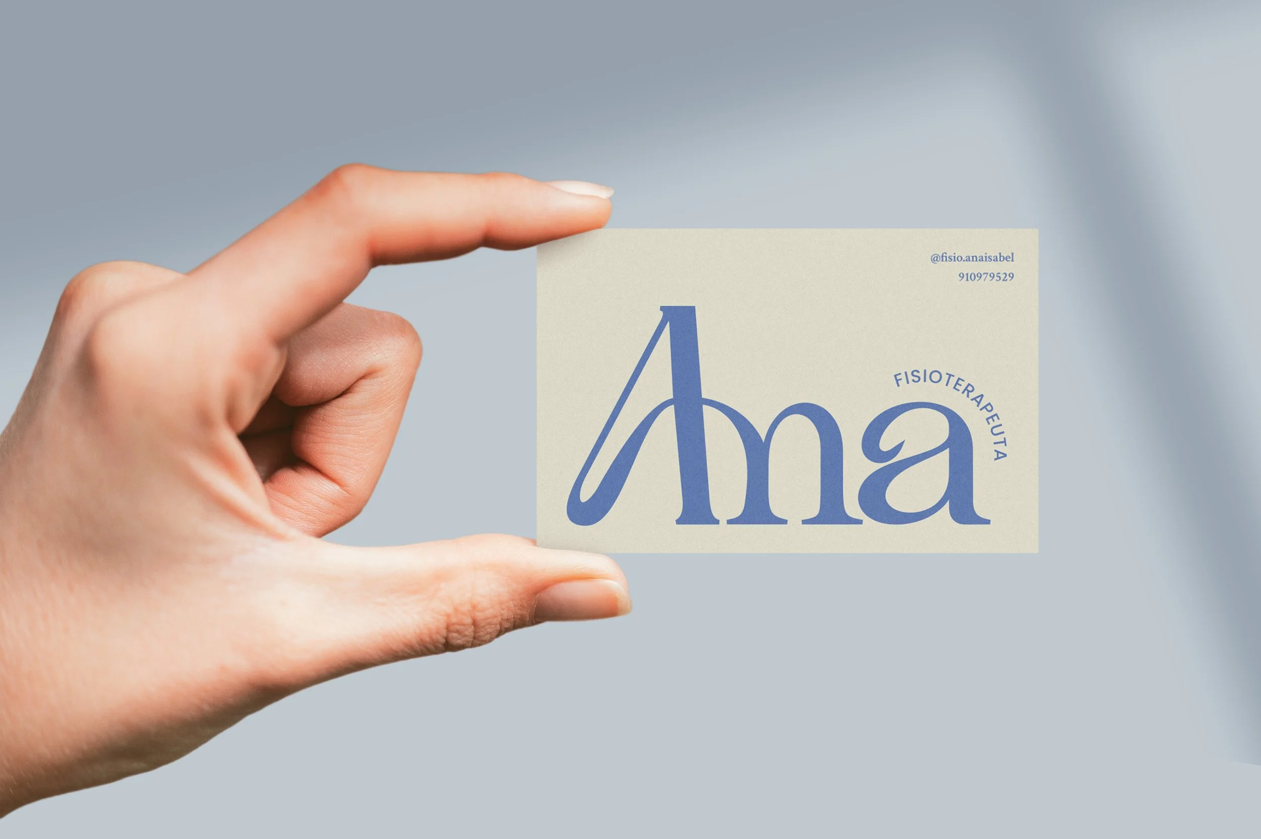
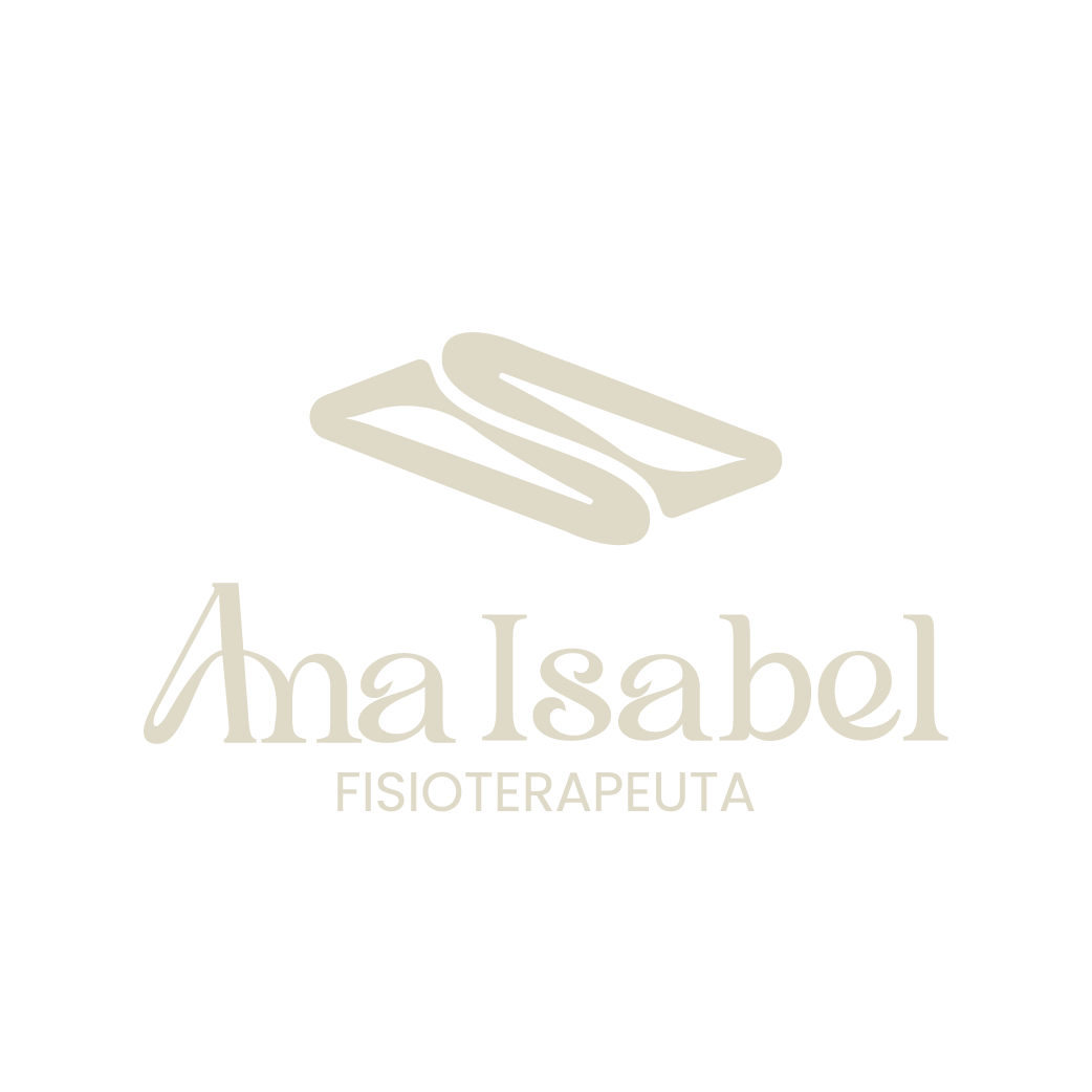
For logotype and variations, the ‘‘A’’ was connected to the ‘‘n’’ in a very rounded, dynamic shape allusive of a rounded back.
PRIMARY
CONTRAST
CONTRAST
Groundness, security, trust
The logo is used in a large scale to promote a sense of proximity between the brand and the client, almost as if they’re receiving a personal letter from Ana. It builds trust and comfort.
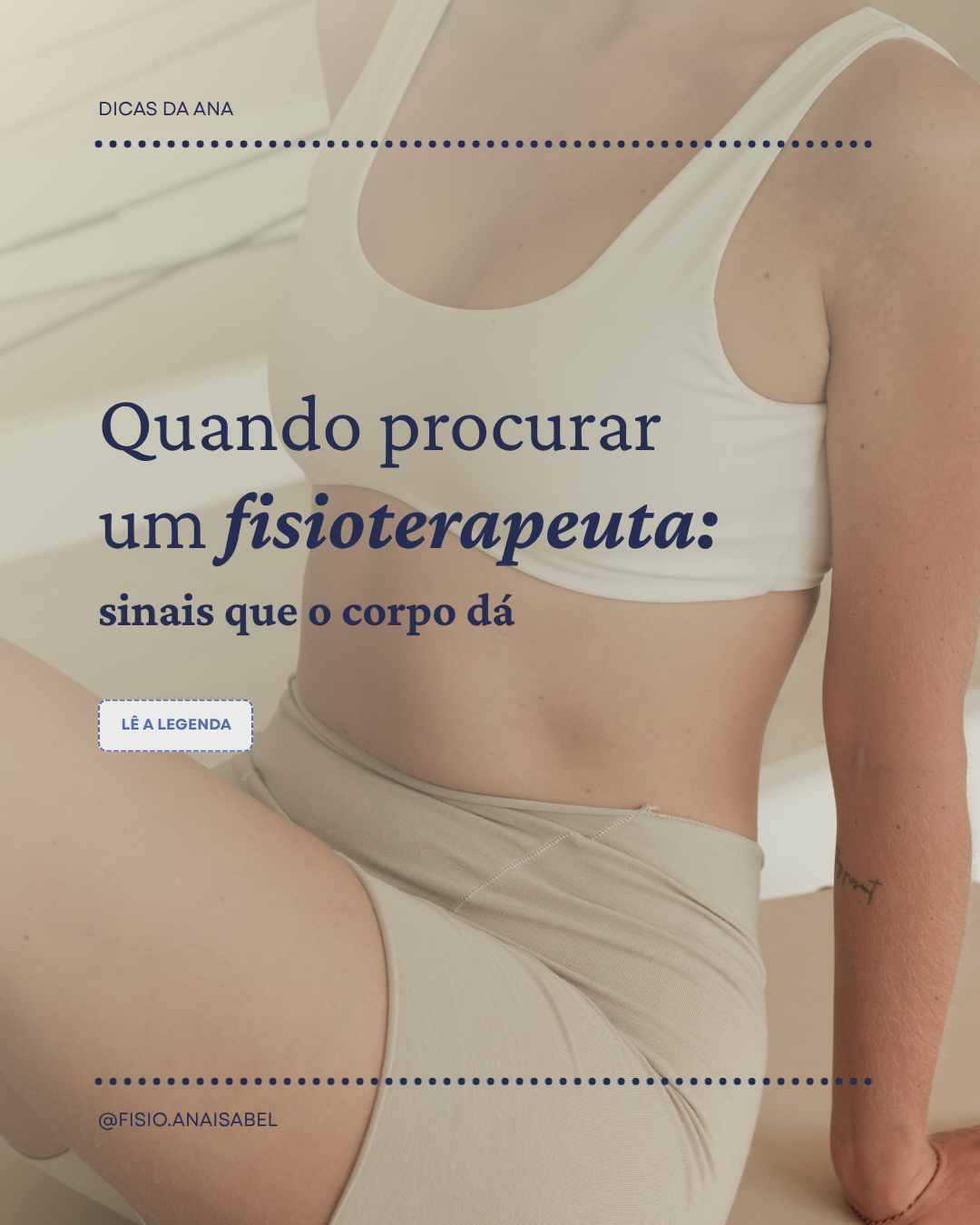
The visual identity should reinforce the idea of movement, therefore the main graphic elements are dynamic, wavey shapes and patterns.
The logomark is an abstract culmination of the name of the founder and a nod to her main service - physiotherapy.
SECOND.
PRIMARY
SECOND.
Lightness, freedom, peace of mind
