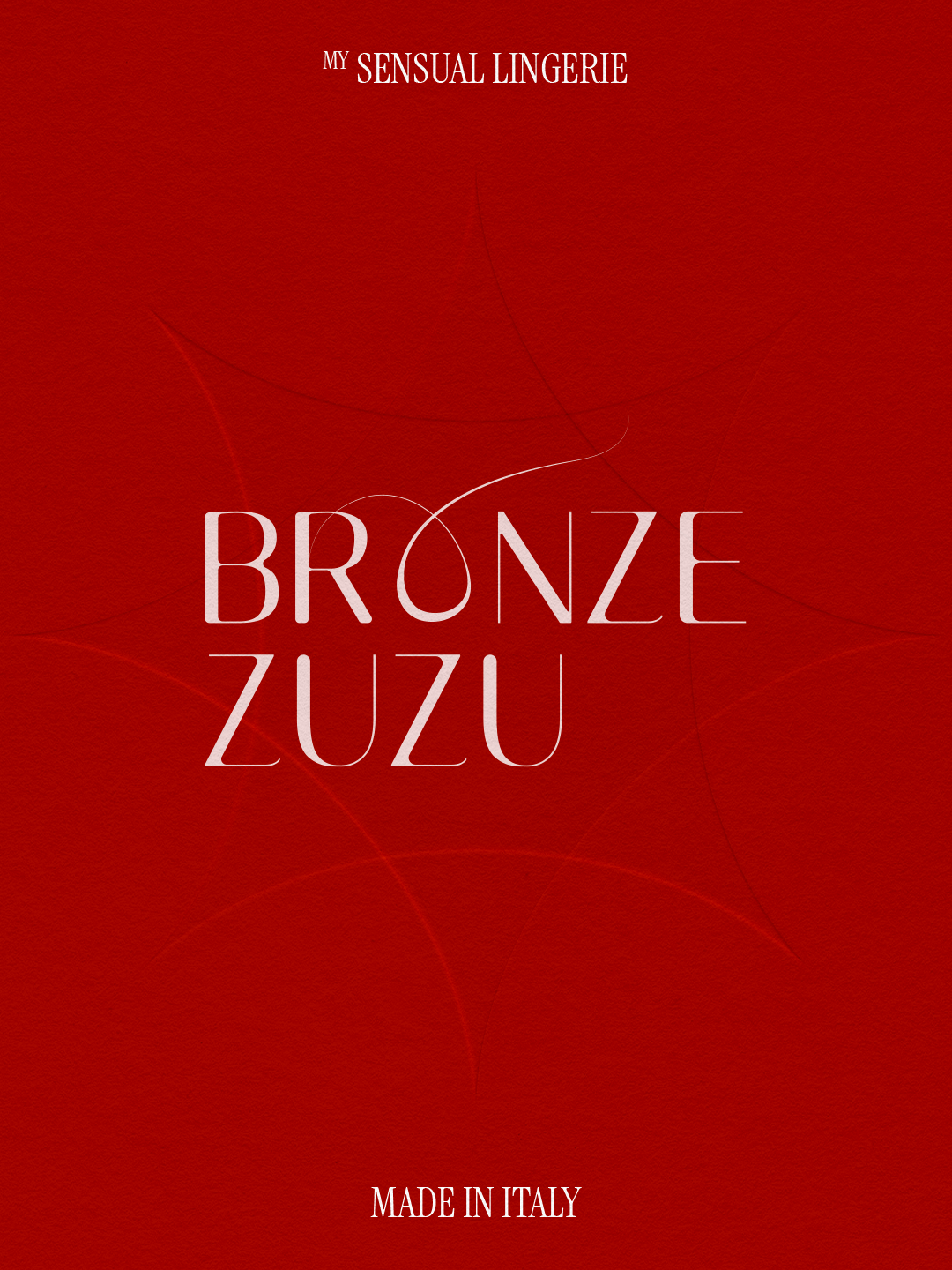

BRONZE ZUZU
The handmade high quality, inclusive lingerie brand, whose main goal is to create stylish and sensual underwear that helps women, exude their most sensual and confident self.
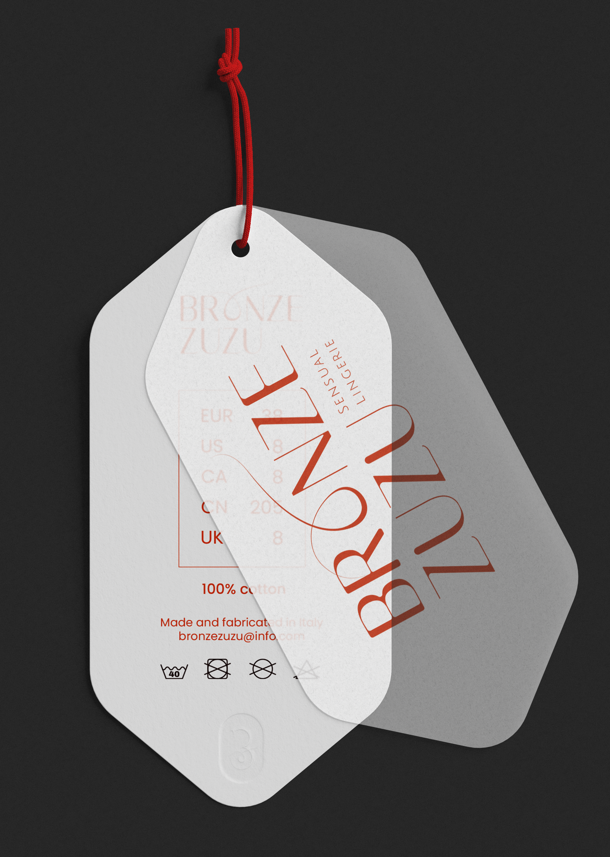
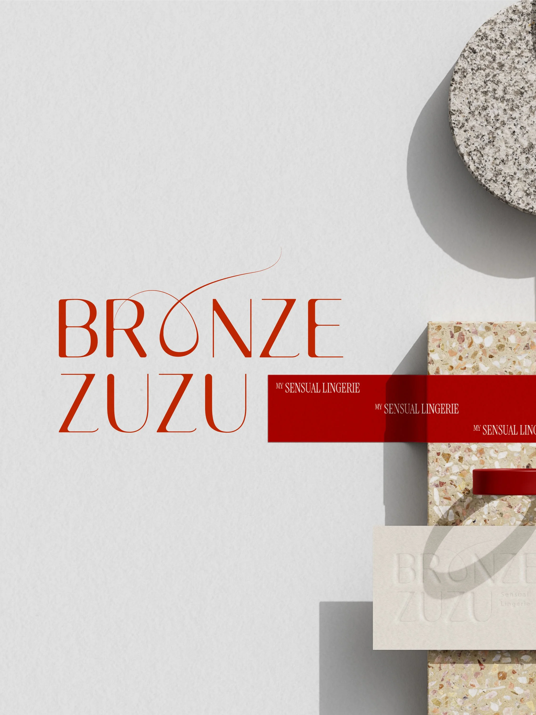
The logotype features strong but rounded type, keeping the look classy but also approchable. The ‘‘O’’ is intentionally handdrawn in a thin flowy line, mimicking a thread of lace, reinforcing the idea of a delicate handmade piece of fabric.
Passion Project
Services Branding
Year 2022
Redesigned in 2025

The wordmark mixes the letter ‘‘B’’ and the interlaced ‘‘O’’, making a loose heart shape at the bottom, figurative of the brand’s inclusivity and message of self-love.
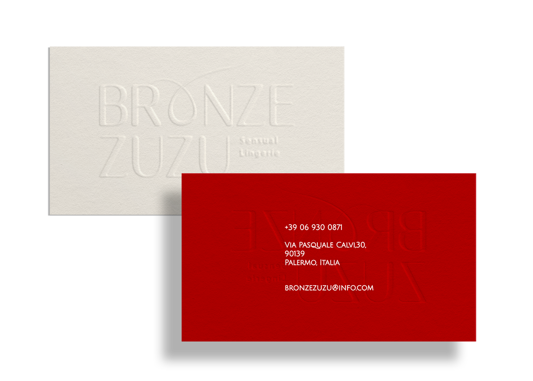
The embossed effect reinforces, both mentally and physically (touch), the ideas of curves, texture or even imperfection, often associated to the body.
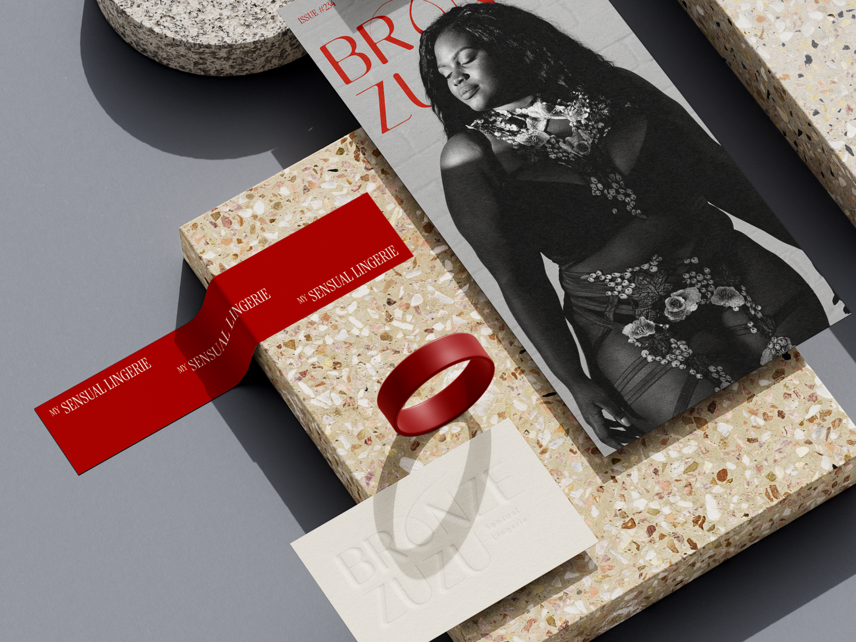

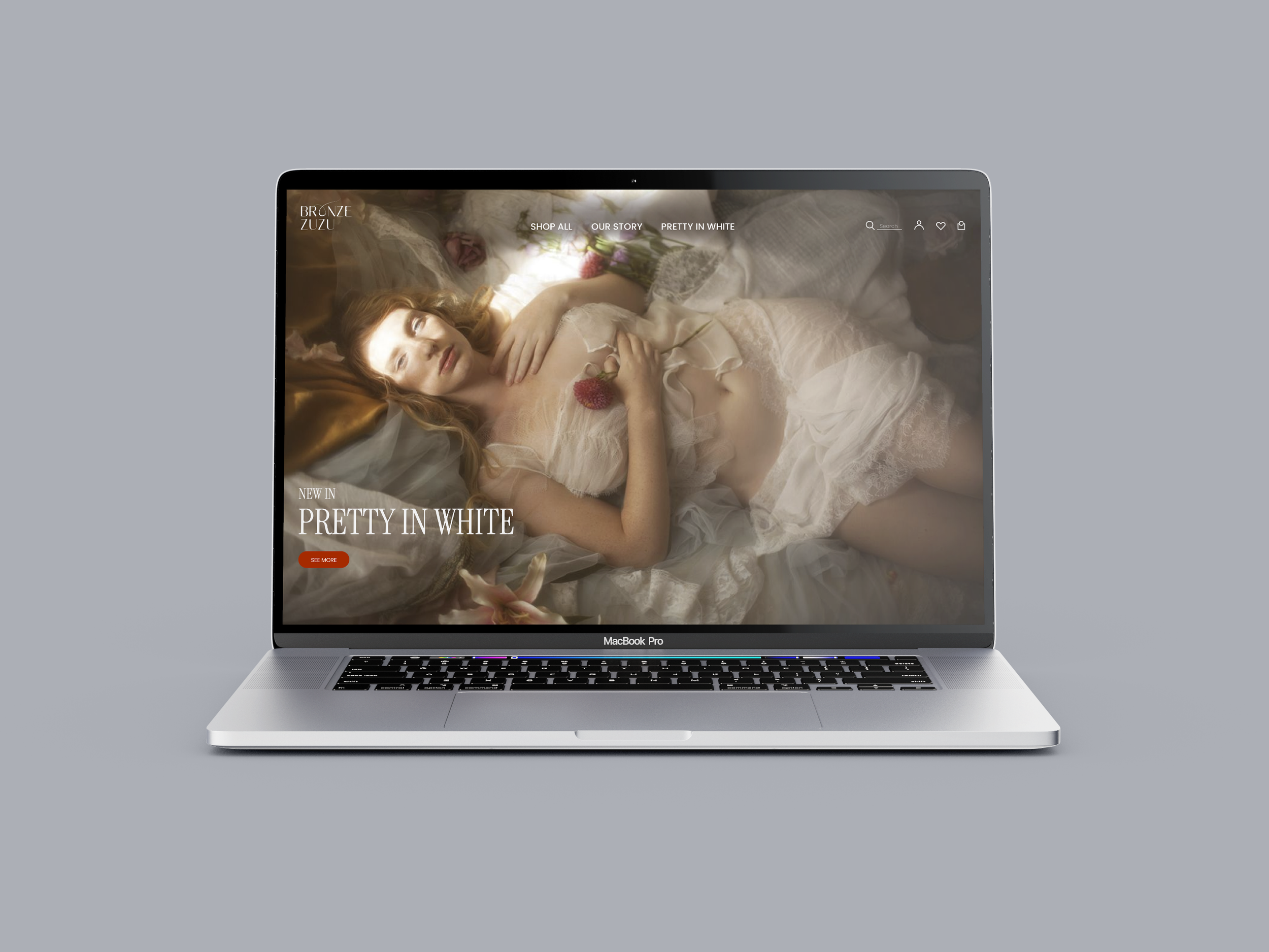
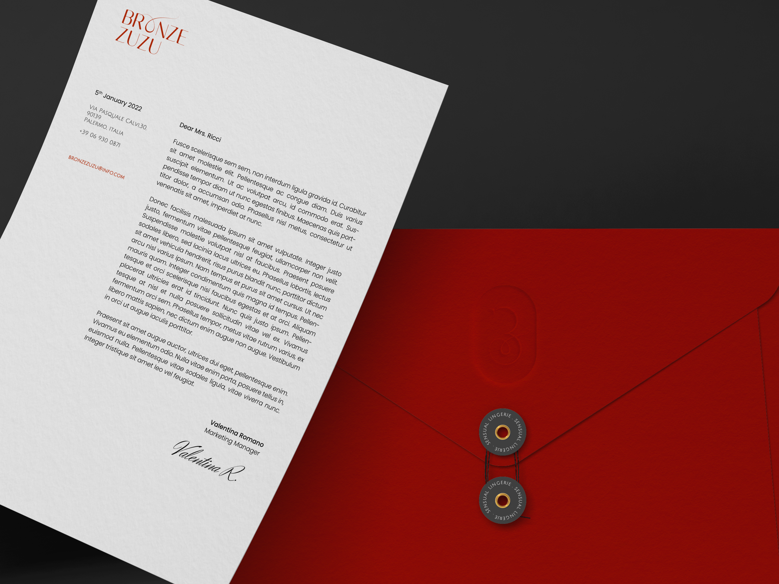
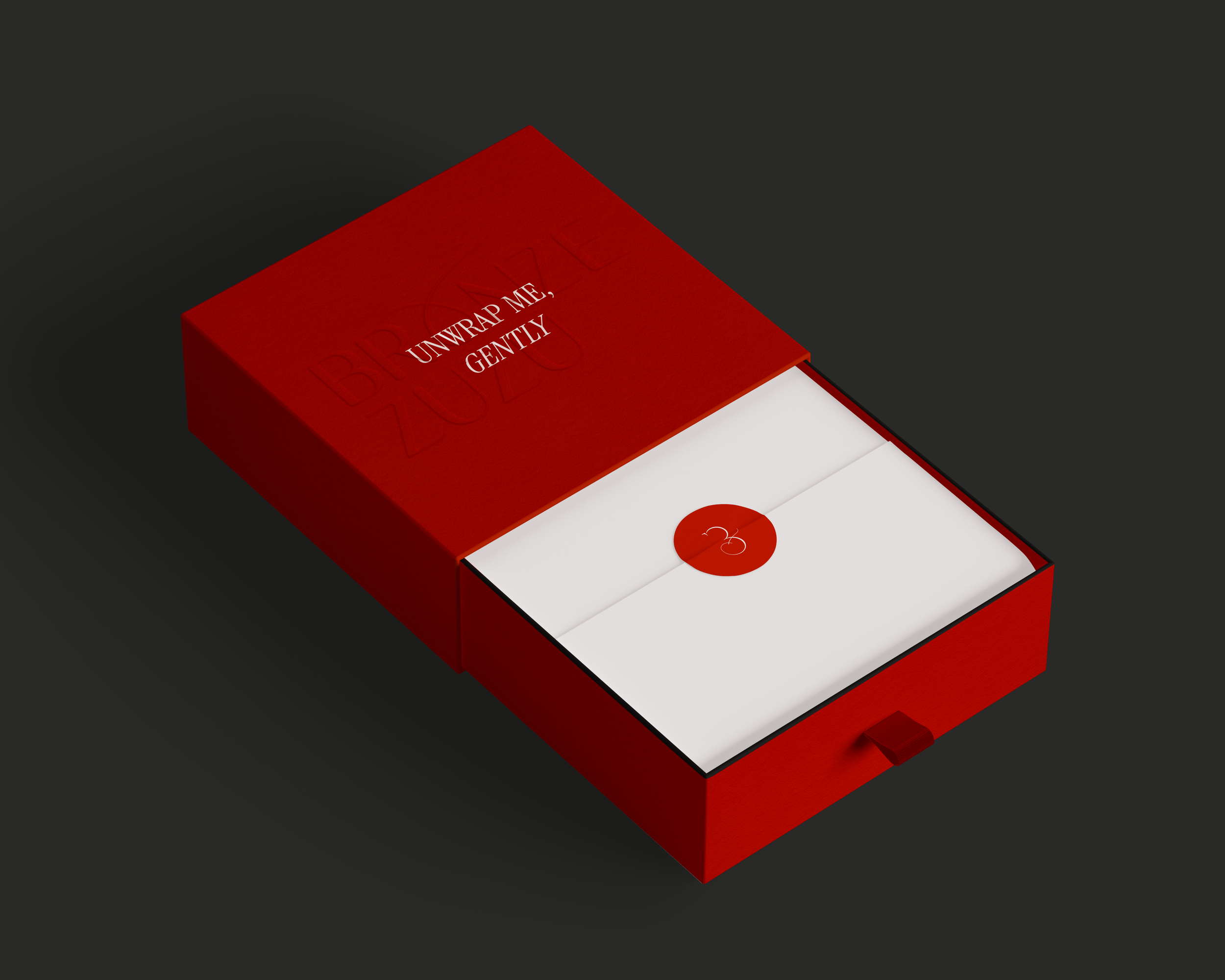
The visual identity is the balance between bold and sophisticated, with bright orangey reds, usually paired with lighter colors such as beige, light grey or white. The black is the neutral ground for contrast.

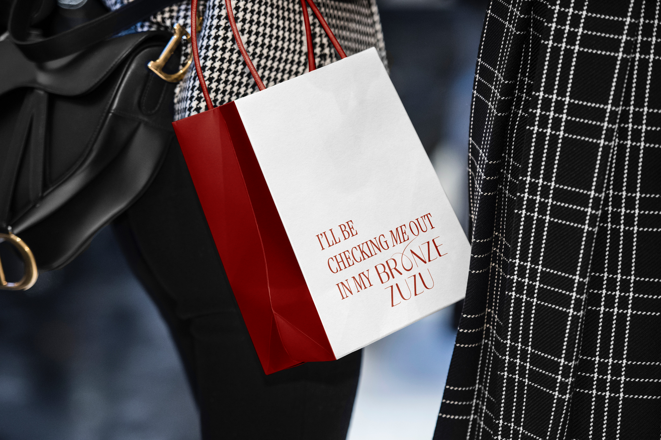
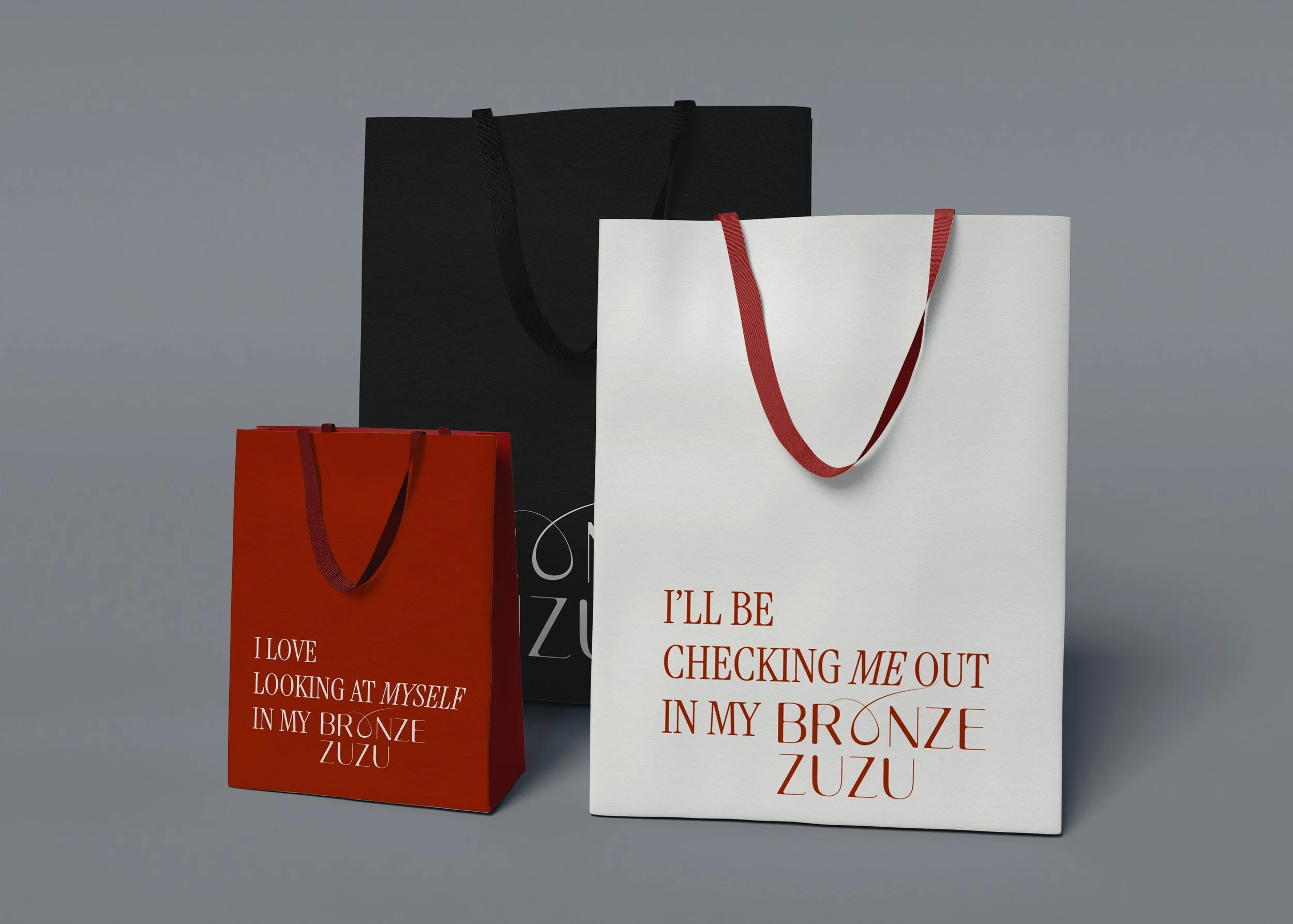
The packaging follows the visual direction of the stationary with playfully sexy wordplay added to bring a sense of self-confidence and comfort, because loving yourself and your body should come easily without the pressure of beauty standards.